In the last edition we pointed out that these 4 important assets were all making compressions at a daily scale. Now that a little time has passed, here is an update on the ‘outrun’ period from those compressions, which are all arrowed in green on these charts:
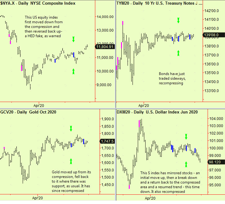
We reminded readers in that same edition of the dangers of a false move. Price trends often start with compressions, and the direction of the new trend is usually in the direction of the initial ‘break’. Sometimes however there is a false break or ‘head fake’ before the market settles into its new trend. That happened here in both US equities and the US $ index. In each case there was an initial short-lived move in the ‘wrong’ direction, followed by a quick reversal. Stocks eventually went up and the $ index down.
Bonds merely ‘wiggled’ and then recompressed and at first sight that also happened in Gold. Closer examination shows that it broke upward from that initial compression, fell back to re-test that area, where it found support (as usual) and then started to resume its up-move. This is further complicated by a re-compression but this seems to indicate that gold will rise. Bear in mind that these are all daily-scale signals, so the impact lasts only three weeks or so.
Meanwhile, in the prior edition, we expected Chinese and Japanese stocks to go higher and to outperform those in other regions. We still think that, but so far only Japan has sprinted upward. Here is an update to the two charts we used then, withe blue arrows on the date of publication:
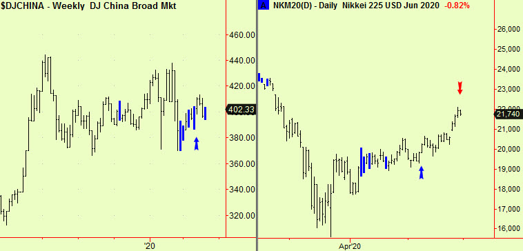
The China market rallied a bit and then fell back to the compressed area. It has now re-compressed but the arguments we used to make the bull case are still valid. We will have to wait and see which way this latest compression leads and would stay long. The Japanese market rallied smartly and in a sustained trend, with two small dips. The red arrow pasted on the chart is because we saw a top extension in another Japanese index yesterday and this probably signals the end of this up-leg in that market. Here is that chart:

You may wish to take some or all profits in Japan but a single daily-scale top extension like this doesn’t usually mean the end of the up-move; it is more usually the start of a sideways period that may then become a ‘top’. We will watch, especially to see if gold really does start to move higher (possibly signifying an increase in general anxiety), in which case we will review our ‘stay cautiously long’ advice in all stock markets, that we began to give in late March.
All signals courtesy of software supplied by our friends at Parallax Financial Research www.pfr.com